- The Tether Signal
- Posts
- 🍽️ 18% Growth From a 45° Nudge...How One Brand Changed Customer Perception With 1 Ad
🍽️ 18% Growth From a 45° Nudge...How One Brand Changed Customer Perception With 1 Ad
Sarah Levinger
October 09, 2025
While digging deep into the corners of the behavior science internet this week, I found a case study of an advertising campaign I’ve never heard of, for a brand I’ve never seen that was so successful, people were buying their product, jacking up the price and reselling it on Ebay. 🤯
Diamond Shreddies was a Canadian cereal that sold the same exact square wheat pillows your grandpa ate for a few years, but eventually stagnated in the market.
Their parent company (Kraft) needed to reinvigorate people towards their product, so they did the smart thing and hired a behavior science expert (Ogilvy Toronto) to try and figure out how to restart the sales engine without spending a dime on product, delivery, or changing their marketing budget.
While inside the initial brainstorm, a wildly smart (or maybe just super observant) intern at Ogilvy noticed: “this cereal isn’t a square, it’s a diamond.”
I think at this point most of the C-Suite team would have rolled their eyes and told this kid to: “go pick up coffee, it’s gonna be a long night…” but luckily this team was smart. They didn’t laugh at this seemingly obvious observation, they took notes (and later hired the intern.)
Ogilvy went back to Kraft and told them to quietly rotate the product photo on the box by 45 degrees (to make the square cereal a diamond), and reship the thing.
This sounds ridiculous (people aren’t stupid, right? They’re gonna know, right?!?!).
But oh my god here’s what happened…
After running ads featuring the 18 degree rotated picture for a few weeks, Kraft reported an 18%+ market share increase. 🤯 Sales poured in and Ogilvy/Kraft won a pile of awards for “advertising effectiveness,” not just cleverness.
Real-world shoppers were so in love with the “diamond” concept, they were auctioning “limited edition” boxes on eBay.
This advertising campaign was so effective, Kraft started shipping new, “limited edition” packaging within weeks, launched TV and web focus-group films, and even created a “combo pack” (half “squares,” half “diamonds”) that invited the public to pick a side. 🤣
To be clear here: these ads framed the exact same cereal as “an angular upgrade.” The internet did the rest.
Ogilvy/Kraft didn’t have to change the product at all; they just changed the frame of reference. (I’m not even kidding, this effect was so powerful, consumers reported the “diamond” shaped cereal tasted better…even though it was the same damn cereal! )
And that’s the while point…
Nothing “magical” happened inside the cereal factory, what changed was the mental model people used to evaluate the product they were already consuming. A tiny, almost silly shift in presentation altered expectation, and that altered expectation changed perception, and that changed behavior. In other words: we didn’t upgrade the cereal; we upgraded the context people judged it in.
When context moves, meaning moves. When meaning moves, money moves.
But (and this is the part you have to respect if you want this kind of lift without backlash) this effect can’t happen randomly.
Ogilvy carefully engineered the collision of a few reliable human tendencies, such as:
How our brains lean on shortcuts when judging familiar products.
How we pay attention when a pattern breaks just enough to feel novel but not enough to feel risky
How identity sneaks into even the most mundane decisions
And how a playful “debate” gives the internet something to do besides scroll past you.
If you understand those levers, you can reproduce the outcome responsibly, transparently, and (best of all) repeatably. (For anyone who wants to go down this rabbit hole with me, here’s the case study + brand artifacts from this campaign!)
Before we talk execution, let’s dive into the mechanics of all this, because the psychology is fascinating.
Here’s why this works (so you can do it too):
Why it worked (the psychology in plain English)
Framing Effect
First, remember that humans don’t judge things in isolation; they judge things relative to the story wrapped around the thing.
“Square” kind of reads generic/old; but “diamond” reads upgraded/special.
Same product. Different meaning. Frame shifts tweak expectation → expectation tweaks perception → perception nudges behavior. Once you feel the “upgrade,” you act like it’s upgraded. (The reported +18% lift didn’t come from fiber content; it came from changing the meaning.)Expectation Violation
Second, we gotta note that any tiny twist that breaks pattern resets all attention (and I’m not talking about hooks here, that’s basic-level marketing).
In categories with decades of “we’re made with whole grains” wallpaper, humor + incongruity buy back mental availability (I’m looking at YOU, skincare, someone please run something other than, “be your best self!”).Identity Play
Next, know that anything stated as a “Diamond” smuggles in micro-status to the brain.
Diamonds are not only forever (for the most part), but they’re also associated heavily with status.
Transferring from “it’s a square” to “jk it’s a diamond” feels like you’re in on the joke, and that social wink is part of what you’re buying. Identity > ingredient, especially in mature categories. (Note the limited packaging run and people literally trading boxes…status rituals, even silly ones, travel far.)Conversational Fuel > Claim
Finally, it’s important to know that they sold a debate before they tried to sell the product.
Squares vs. diamonds.
Same cereal, different teams. That gives social objects (comments, stitches, duets) something playful to orbit, which earned more reach than repeating another “now crunchier!” RTB.
Micro-teardown of the creative system (so you can rebuild it for your brand)
They used a visual device: a 45° rotation was specifically chosen because a five-year-old could understand it. (Your visual “move” must be that simple. If it needs a white paper, it’s not a reframe, it’s homework.)
They named it: It’s as simple as that. Naming the new upgrade to “Diamond” = upgraded schema without lying. It’s still a square (duh), just reframed. Your name swap should be unmistakably true in one dimension and provocatively “new” in another.
They used something called a “narrative device” to explain it: they literally ran ads with a faux focus group so we could all watch them “discovering” the “new” product. Why? Because watching someone’s expectation get violated lets the viewer experience the same dopamine safely. 😅
They spoke their product truth with conviction: there was zero formulation change here. They simply said: “we made it a diamond” and left it at that. That’s the elegance: same molecules, new meaning.
They didn’t wait to make sure they were right: because this was Kraft we’re talking about here, I think it goes without saying that there was probably a TON of red tape they had to go through to get this concept to market, so I don’t want to hear anyone saying, “that’s gonna be too hard for us.” 😆 Hook with an absurd premise; play it straight; let the audience argue in the comments so you can learn from there.
They made a massive merch move: Once people started grabbing on to the concept, Kraft launched limited packaging to make the joke tactile, collectible, and scarce.
“Okay Sarah, but how do we do this without looking like an idiot?”
Great question, I would love to answer this for you. 😊 We do this by building reframes that are (1) transparent, (2) testable, and (3) reversible. No gaslighting people into purchasing, no brittle positioning, no expensive ops debt.
Here’s how to do this for your brand (step-by-step):
Step 1 — Map your unchanged truth
List three things you refuse to change in the next 60 days (formulation, SKU mix, supply chain). These are your guardrails. Reframing works because it accepts constraints and gets creative anyway.
Step 2 — Choose a single expectation to challenge
Pick one characteristic (angle, name, context, sequence) you can flip without lying. You’re not inventing a feature here, you’re just re-labeling a perspective. Examples:
Coffee: “Dark roast” vs. “Midnight Mode.”
Supplements: “Daily multivitamin” vs. “Baseline Stack.”
Cosmetics: “Matte finish” vs. “Studio-Matte.”
Kitchen tools: “Stainless steel” vs. “Chef-Grade Steel.”
Step 3 — Decide your playful tension
What “two teams” can you create that people will joyfully debate? (This matters more than you think; arguments drive comments; comments drive reach.)
Powder vs. Pods (supplements)
Handle vs. Handle-less (mugs)
Desk vs. Travel (organizers)
Spoon vs. Spork (camping gear)
Matte vs. Glow (cosmetics)
Craft a campaign like this, and you’re no longer just “persuading someone to buy”…you’re conducting a social experiment in perception and allowing people to join in on the fun.
The real magic of Diamond Shreddies wasn’t the cereal at all, it was the mirror it held up to consumers. It revealed how fragile and flexible our sense of “new” really is. People don’t buy products really; they just buy meaning. And as marketers…we get to decide what things mean to the people who need our products.
So, the next time you’re tempted to pour money into another flavor, SKU, or influencer deal, ask yourself:
What if the most powerful upgrade isn’t in the product at all, but in the story people use to judge it?
The goal isn’t to trick your audience. It’s to show them something they’ve stopped seeing. To make the familiar feel fresh again. To rotate the product 45° and remind them that even the oldest ideas can sparkle when you change the angle of light.
Because when you do it right, the cereal doesn’t change.
The consumer does.
TLDR; Perception is a growth channel…not just a new coat of paint.
Diamond Shreddies proved it: you don’t always need to persuade harder or educate longer to move behavior. Sometimes you just need to show the cereal on its side…and watch the numbers follow.
Inside Tether Lab (Skool), we turn that principle into a repeatable system:
Weekly Funnel Clinics & Q&A: Bring a live ad/account problem; leave with reframes you can test this week.
Psychology-Backed Prompts & Templates: Frame words, edition badges, “two-team” debate scripts, LP H1 swaps—copy, paste, ship.
Creative Teardowns (Diamond-Style): We rotate your “square” offers 45° and build low-cost experiments (ads + LP continuity) that you can run in 48 hours.
Metrics, Not Vibes: CTR/ATC/CVR guardrails, conversion-lift basics, and post-mortems so the wins stick and the misses teach.
If you want to practice the “$0 reframe, measurable lift” move with a room full of operators who speak ROAS and psychology, this is where we do it!
Come learn how to bend perception to grow faster. Join Tether Lab on Skool.
Until next week,
🦕 Sarah

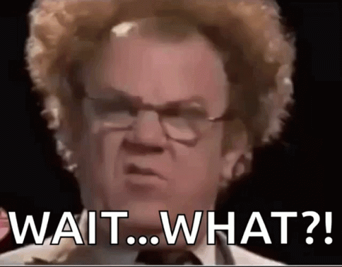
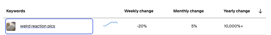
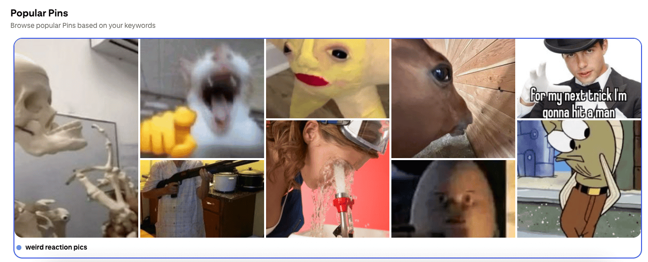
🚨 Dex’s Trend Alert: Weird Reaction Pics = The Return of Emotional Currency
Searches for “weird reaction pics” are up 10,000%+ year-over-year — proof that the internet’s emotional language is mutating again.
What used to be snappy text replies (“mood,” “same”) is now replaced by cursed JPEGs that speak in facial expressions, not fonts.
Apparently, we’ve moved from posting thoughts → posting vibes → posting faces that say what words can’t.
📈 The Signal: Emotion Is Going Visual Again
→ Reaction pics are the new punctuation marks.
→ They’re bite-sized empathy—cheap, fast, and universal.
→ The weirder they are, the more they feel true (because blended/awkward emotion is often the most honest emotion).
This isn’t about memes. It’s about emotion compression:
One image = 1,000 micro feelings.
They work across languages, age groups, and algorithms.
🧠 The Diagnosis: We’re All Craving Visible Emotion
In an era of AI-perfect everything, weird faces feel real.
They carry texture, humanity, and imperfection.
Identity signal: “I still have feelings, even if the algorithm doesn’t.”
Psychological mirroring: Viewers see their own discomfort and laugh instead of scroll.
Cultural relief valve: Expressing emotion through absurdity keeps it safe and funny.
📌 How to Capitalize:
🛍️ For DTC Brands
Use faces, not features.
→ Swap “lifestyle smiles” for unfiltered, mid-emotion shots.
→ Add a “reaction moment” frame in UGCs—show the response not the product.
→ Make emotion a design layer (packaging faces, emoji codes, expression textures).
🎥 For Creators & Media Buyers
→ Lean into “face as hook.” The scroll stops where emotion starts.
→ Use weird, dissonant reaction clips to punctuate edits—micro meme storytelling.
→ Remix your own ad comments into reaction compilations.
🧠 For Strategists
→ Emotional bandwidth is shrinking.
→ A single expressive face can convey more relatability than 30 seconds of scripted copy.
→ Stop asking “what’s the message?” and start asking “what’s the emotion payload?”
💡 Pro Move:
Build a “Reaction Library” for your brand—faces, gestures, sounds, micro-moments you can remix endlessly. Train your UGC creators to deliver emotion packs, not talking points.
Until next time—
Stay curious, stay weird, and remember:
If they’re searching “weird reaction pics”…
they’re not trying to find memes.
They’re trying to feel something real again.
🦖 Dex