- The Tether Signal
- Posts
- 💊 $1B for Paper Pill Packets: Why Amazon Bet on Behavior Over Innovation
💊 $1B for Paper Pill Packets: Why Amazon Bet on Behavior Over Innovation
(Also, why didn't I think of this...😅)
Sarah Levinger
July 10, 2025
Pop quiz:
Which brand did Amazon buy for $1 billion… because of its packaging?
No it’s not a tech company, manufacturing breakthrough, or software tool.
It was actually a tiny brand that produced a little plastic packet that pre-sorted product by date and time…
The brand was PillPack.
And I can’t stop studying them. 🤯
This brand pulled off the impossible by taking an everyday item (something nearly 70% of adults in the U.S. interact with on a daily basis) and removing so much complexity, frustration, and friction from it, that the only logical response was to buy.
What made PillPack brilliant wasn’t what they sold, per se, it was how ridiculously easy they made it to consume again and again. They took something chaotic (remembering, sorting, organizing, taking pills) and made it feel like opening a freaking fruit snack.
Effortless.
Almost automatic.
And when you study how they did it, you realize: any brand can borrow this playbook.
Let’s break it down.
This Is How PillPack Got Popular
(And Why Your Product Might Be Missing the Same Advantage)
PillPack is such an interesting behavioral case study because they didn’t win the “normie” way: AKA by being loud. 😅 On the contrary, it won because it was clear.
And clarity (not cleverness) is what makes a busy, overtaxed, stressed-out mind sit-and-stay.
Let’s break down the 5 behavior design levers that turned this humble pill packet into a billion-dollar business:
1. 🧠 They eliminated cognitive load
Ask anyone who takes multiple prescriptions on the daily and they’ll tell you: the worst part is rarely ever “the pills.”
You’ll often hear more situational things like:
• “I forget to take them.”
• “I don’t know which ones to take and when.”
• “It’s too much to think about.”
PillPack solved that — not by educating customers or building an app, but by removing the need to think altogether. They took a multi-step decision (“Which pills do I take this morning?”) and reduced it to one simple behavioral script:
Do I open the next packet…or is it not time yet?
That’s it. That’s the entire job-to-be-done.
And in the world of behavior design, this is called choice architecture — restructuring the environment so the easiest choice is the right one.
When I tell you the key to growth is “reduce friction,” I’m not just talking UX design. I’m talking about literal brain friction — the mental processing power people burn just trying to make the “right” call.
(This psychological discovery of the effects of “cognitive load” was made famous in a 1996 study where shoppers were offered 24 flavors of jam.
In that experiment, only 3% actually bought anything.
Reducing the choice set to just 6 flavors, however, increased purchases by 10X. 🤯)
Too many options trigger analysis paralysis. Period. So PillPack did the obvious thing: they didn’t offer any. They offered a protocol instead.
Overwhelmed people (👋 me) love protocols.
Because protocols feel like safety. Like order.
Like someone else did the hard thinking for you.
2. 📦 Their packaging signaled control
Now let’s talk about their design, because neat little packets (AKA: pill boxes) already existed in the market. PillPack was up against some easily accessible, highly economical options, so here’s what they did:
They systemized your personal routine.
Each “pill pack” came with your name on it (so you couldn’t mess up.)
Each “pill pack” had when to take them printed on it (so you couldn’t mess up.)
Each “pill pack” had a precise list of what was inside (so you couldn’t mess up…you get it.)
No ambiguity. No vague instructions. Just a tidy roll of customized directions, printed clearly and dispensed in order.
It didn’t just reduce confusion…it eliminated it.
This is one of the core principles of design psychology: visual clarity builds internal certainty. When a product looks like it knows what it’s doing, our brains instinctively trust it more.
When we experience products that are built to look like it knows what its doing, our brain naturally thinks, “They’ve got this handled,” even if we don’t consciously realize it.
That’s why PillPack’s system worked so well. Not just because it was helpful, but because it looked helpful. It visually told the user: “You don’t need to worry. We’ve already figured this out.”
And when people feel like the hard part is done for them, they follow through.
3. 🔵 They used calm color psychology
Before anyone reads your copy, they’re feeling your brand. And color is one of the fastest emotional triggers in the brain.
PillPack didn’t go with loud branding or urgent red labels. They chose soft whites, calm blues, and gentle gradients. It didn’t scream “LOOK AT ME” — it whispered, “You’re okay. Keep going.”
Color is the one thing (most) of us have interacted with our entire lives. The brain is incredibly familiar with it, and will often assign specific emotions to specific colors, based on what objects it finds those colors on (look up the study on the black and gold dress, it’ll blow your mind!)
These visual cues quietly tell your nervous system what is safe and what’s probably poison. If your design communicates safety and ease just by being colored correctly, the brain won’t interpret danger. Instead, your brand and products will feel gentle, easy, and trustworthy.
And in a category where anxiety runs high (like medication management with its chronic illnesses and long-term care) that emotional signal matters way more than any feature list ever could.
4. 🤖 They combined automation with a human face
Here’s where PillPack got especially smart:
They automated the chaos but humanized the touch points.
Behind the scenes, robots were filling tens of thousands of prescriptions every day. Inventory synced across pharmacies. Refills shipped automatically. Tech did the heavy lifting.
But on the front end, you could message a real pharmacist. You could ask questions. You could feel like someone was there…a human, not a help desk.
This is the sweet spot in modern service design: high-efficiency systems plus intentional empathy.
Most brands default to one or the other — fully automated and cold, or fully human and unscalable. PillPack proved you don’t need empathy everywhere, just somewhere meaningful.
When the system runs itself but the person feels cared for… that’s when trust compounds.
5. 💊 They sold emotional transformation, not a product
The final thing PillPack did right was something they didn’t do…
They didn’t sell smart systems or superior logistics: “We’re the #1 pharmacy amazing expert it all things medication, medical jargon, BUY OUR STUFF!!”
They sold a feeling: “You’re doing this right. We’re here to support you. Its safe to move to the next step…”
They didn’t demand behavioral change. They made the environment so well-designed that the right behavior happened naturally.
That’s the holy grail of behavioral psychology. Not to push people harder, but to make success feel inevitable.
They reduced friction to the point that not doing the right thing felt harder than doing it.
🧠 PillPack’s Secret Weapon: A Cue You Can’t Ignore
I want to pause here and talk about a secret tool PillPack used that also happens to be one of the most underrated behavior tools in the game: the prepotent cue.
This is a signal so strong, so clear, and so tied to an action that your brain doesn’t even think — it just reacts.
Here’s a great example of a prepotent cue:
The smell of coffee = grab a mug
A toddler holding something sticky = grab the wipes
A pill packet with your name, your meds, and your timing = take the pills
To the brain, a prepotent cue is not a suggestion. It’s a script. And the brain loves scripts — especially when we’re tired, overwhelmed, or just trying to make it through the day.
PillPack didn’t “nudge” people into remembering, because (as we all know from trying to stick with a workout routine)…nudging only works when the system is fully fed, fully charged, and motivated to work.
Instead, they embedded a personalized cue directly into the experience. One that was timely, specific, and emotionally anchored to trust.
The result was no resistance. No hesitation. Just automatic behavior.
So… Why Did Amazon Pay $1 Billion for PillPack?
Amazon isn’t just a retailer, it’s a systems company. And PillPack didn’t just sell pills. It proved that if you control the behavior, you control the outcome.
Higher adherence meant better health outcomes.
Better outcomes led to better partnerships with insurers.
And better partnerships unlocked control over healthcare delivery at scale, and that predictable, repeatable, automated behavior engine — built on psychology, not just logistics — was what Amazon bought.
❌ Packets.
✅ Protocol.
That’s how you win.
What This Means for You
If your product helps people make better decisions, but they keep falling off the wagon…
I want you to focus on how heavy the experience of your product is first.
A “heavy experience” can mean:
Too many steps
Unclear instructions
No visual clarity
A general feeling of “I’m on my own here”
Even a secondary step during checkout can feel like too much! When things feel too heavy to carry, people stall. Even when the outcome matters deeply to them. So ask yourself:
Am I giving people clarity or more decisions?
Does my design look helpful or feel helpful?
Are people failing because the product doesn’t work… or because the process is exhausting?
Note: your customer isn’t lazy, uneducated, or unmotivated — SO STOP BELIEVING THAT!
They’re overwhelmed…which means they need something or someone to simplify things for them so they can move past the freeze and towards the solution.
TL;DR
PillPack didn’t sell pills. They sold clarity, confidence, and the subtle but powerful feeling of “I’m doing this right.” That’s what made them worth a billion dollars.
Want to Apply This to Your Brand?
Here’s your 5-step checklist to build a behavior-first product experience:
Simplify the action
Break complex behaviors into one single decision. Remove the need to “figure it out.”Make clarity visual
Use design — not just words — to show people what’s happening and what’s next.Automate the hard parts
Let technology handle logistics, reminders, and tasks that disrupt flow.Keep a human somewhere
People don’t need hand-holding. But they do need to feel like someone is there, just in case.Test for friction you didn’t mean to create
Because most drop-off isn’t a rejection of the product. It’s a byproduct of confusion, doubt, or exhaustion.
If you want help spotting those friction points, just reply to this email or schedule a time to chat with me! I’ll show you what your customers are really feeling — and how to redesign the experience so behavior change becomes effortless.
Because the best marketing doesn’t try to convince people to want it more…
It just makes success feel easier than failure.
Until next week,
🦕 Sarah

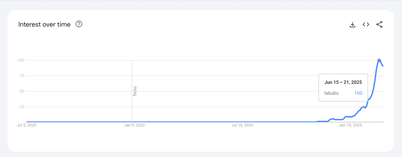
🚨 Dex’s Trend Alert: 10,000%+ spike – Lafufu is everywhere and it’s creepy…
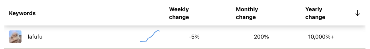
You may not know its name, but the algorithm does. Search volume for “Lafufu + Labubu toy” has skyrocketed—up over 10,000% in the past few weeks.
But here’s what makes it fascinating:
Consumers aren’t just chasing cute stuff…They’re chasing cute stuff that’s a bit contradictive.
Right now, the internet is obsessed with products that blend two things that shouldn’t go together:
Aggressive gentleness (Stanley Cups in tactical camo)
Luxury laziness (cashmere sweats)
Goth girl bedtime tea (yes, that exists)
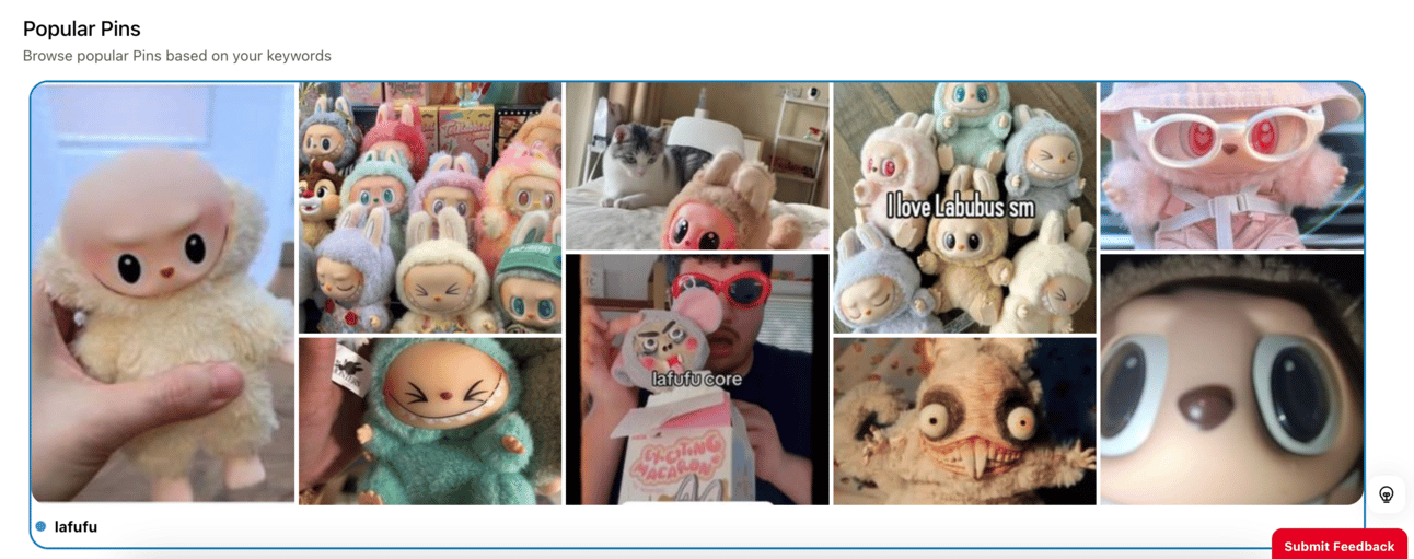
And Lafufu? It’s the holy grail of weird-but-right:
A slightly feral gremlin that somehow makes you feel emotionally safe.
📈 The Signal:
This is what virality looks like when it means something. Lafufu toys blend three powerful forces:
→ Cuteness overload (Kawaii aesthetic)
→ Collectible scarcity
→ Oddball identity signaling
You’re not just buying a toy. You’re buying a weird little friend who gets you. Or at least makes your desk look like it does.
🧠 The Diagnosis:
This isn’t just a collector trend. It’s a psychological mirror for what today’s buyer wants to feel:
→ Control in chaos
These characters are chaotic, lovable, and oddly grounded. They offer emotional containment—especially for buyers deep in “soft life” or “healing girl” mode.
→ Micro-identity flexing
You’re not mainstream. You’re specific. Owning something obscure on purpose is the new status.
→ Toy-as-totem
We're not “playing.” We’re anchoring our nervous systems with objects. It’s emotional self-regulation, disguised as a purchase.
📌 How to capitalize (without looking like you’re 3 weeks late):
🛍️ For DTC Brands
Anchor your product in a weird but lovable archetype.
→ “This isn’t just skincare. It’s your emotional support serum.”
→ “The tote bag your inner child would approve.”
🎥 For Creators & Media Buyers
Lean into nostalgia meets nonsense.
→ Use pastel filters, toy unboxings, POVs from the toy’s perspective.
→ Echo the vibe, not the exact product. (Hint: it doesn’t have to be a toy.)
🧠 For Strategists
This is a perfect use case for microtrends with macro payoff.
One of our students spotted this early, ran a soft angle with collectible framing—and did $30K in spend at a 2X ROAS. No discounts. No gimmicks. Just vibe-matching done right.
💡 Pro Move:
Run a "Which Emotional Support Object Are You?" quiz.
It’s fun. It’s personal. And it lets you map buyer mood to product category in one frictionless swoop.
Until next time—
Stay weird, stay watchful, and remember:
If your buyer’s inner child doesn’t love it, their credit card won’t either.
—Dex 🦖